Typography / Task 1: exercises
9/30/2023 - 10/10/2023 (week 1 - week 6)
Abdullah Yazdan Zahid - 0367869
Bachelor of design in Creative media
task 1: exercises
LECTURES
WEEK 1:
INTRODUCTION
Typography is the art of the creation of typefaces or typefamilies. However, it is not just the art of simply typing letters. It is arranging type to be readable and visually appealing.
Typography is something that is extremely important for a designer in any field. In fact, tyography is so prevalant in our everyday lives that we can see it almost anywhere we look. From directions on a sign to the apps on your phone. This is why making sure that the readabilty and effectiveness of your typography is so important.
Before typography there was caligraphy and lettering. caligraphy is the style of writing and lettering is drawing out the circumference of the letter.
LECTURE 1 : DEVELOPTMENT / TIMELINE (typo_1_developtment)
Early letterform developtment: Phoenician to Roman
In the olden days writing was developed by indenting into wet clay with sharpened sticks. The instrument used to create the forms will greatly effect how the script ends up. In the case of Phoenician alphabet, the uppercase forms are a combination of simple lines and curves.
 |
| Fig. 1.3 Boustrophedon |
Handscript from 3rd - 10th century C.E
- Square capitals (4th or 5th century): The tools used in this era has a slant which cause the letters to have sudden thick and thin strokes.
- Rustic capitals (Late 3rd - mid 4th century): The letters where developed to make take less space.This made the hand script to be more compressed. In order to get this effect the pen at an angle
- Roman cursive (4th century): This is the early stages of lowercase letterforms. Roman cursive was used for more informal writings where you prioritize letters which are simple and faster to write.
- Uncials (4th -5th century): Uncials incorporates elements of both upper and lower case into the writing system. Uncials is more readable at small sizes when compared to rustic capitals.
- Half-uncials (C. 500): This is the beginning of lower letterform, including ascenders and descenders.
- Caloline miniscule (C. 925): A writing method developed by Alcuin of york, Abbot of St Martin of Tours under the order of Charlemagne, the first unifier of Europe, in order to standardize all ecclesiastical texts.
- Blackletter (C. 1300): After end of Charlemagne's empire regional variation of Alcuins script started developing. One of which known as Blackletter or Textura gained popularity.
Text type classification
- 1450 Black letter: The earliest printing type. Its forms were based upon the hand copying styles used in northern Europe.
- 1475 Oldstyle: Based upon the lowercase forms used by italian humanist scholars for book copying.
- 1500 Italics: The first Italics were cendensed and close-set, allowing more words per page.(Note: when you use serif letters that are Italicised, they are called Italics, but when using letters that don't have serifs it is known as oblique)
- 1550 Script: Originally an attempt to replicate engraved caligraphic forms. This text is not appropriate for use in lengthy texts due its decorative and hard to read nature.
- 1750 Transitional: A refinement of oldstyle forms that developed due to the advances in casting and printing. Thick to thin relationships were exaggerated and brackets were lightened.
- 1775 Modern: This style represents a further rationalization of oldstyle letterforms. serifs were unbracketed and the contrast between thick and thin strokes were more extreme.
- 1825 Square serif / Slab serif: Originally heavily bracketed serif, with little variation between thick and think strokes. This was use in commercial printing, However, as they evolved the bracket were dropped.
- 1900 Sans serif: This typeface eliminated serifs alltogether. Variation tended toward either humanist form or rigidly geometric. Occasionally strokes were flared to suggest the calligraphic origins of the form. Its was also reffered to as grotesque and gothic.
- 1990 Serif / Sans Serif: Enlarges the notion of a family of typefaces to include both serif and sans serif alphabets.
 |
| Fig. 1.11 - representation of text with and without kerning |
Flush right: This format places emphasis on the end of a line as opposed to its start. It can be useful in situations where the relationship between text and image might be ambiguous without a strong orientation to the right.
The x-height refers to the area between the baseline and the line above the baseline. The line above the baseline is known as the median or mean line. The x-height in contrast to the ascender space descender space decides wether the x-height is below. The space above the x-height is known as the ascender and the space below the x-height is known as the descender. The x-height is larger in proportion to the ascender and descender which increases readability.
Leading and line length
The goal in setting text type is to allowe for easy, prolonged reading. At the same time a field of type should occupy the page as much as a photograph does.
Type size: Text type should be large enough to read at a arms length.
Leading: Text that is set too tightly encourages vertical eye movement.
It is often useful to enlarge type to 400% on the screen to get a clear sense of the relationship between descenders on one line and ascenders on the line below.
LECTURE 3 - TYPO_3_TEXT_P2
Widow: A short line of type left alone at the end of a column of text.
Orphan: A short line of type left alone at the start of a new column.
 |
| Fig. 1.26 - example of widow and orphan |
In justified text both widows and orphans are considered serious gaffes. Flush right and ragged left text is somewhat more forgiving towards widows, but only a bit. Orphans remain unpardonable.
Cross aligning headlines and captions with text type reinforces the architectural sense of the page and the structure whilst articulating the complimentary vertical rythms.
 |
| Fig. 1.34 - Examples of cross-alignment |
LECTURE 4 - TYPO_2_BASIC
- Base line: The imaginary line the visual base of the letterforms.
- Median: The imaginary line defining the x-height of letterforms.
- X-height: The height in any typeface of the lowercase 'x'.
- Stroke: Any line that defines the basic letterform.
- Apex / Vertex: The point created by joining two diagonal stems. The apex is on the top and vortex is on the bottom.
- Arm: Short strokes of the stem of the letterform, either horizontal or inclined upward
- Ascender: The porton of the stem of a lowercase letterform that projects above the median.
- Barb: The half-serif finish that is seen on some curved strokes
- Bowl: The rounded form that describes a counter. The bowl may be either open or closed.
- Bracket: The transition between the serif and the stem.
- Cross stroke: The horizontal stroke in a letterform that joins two stems together.
- Crotch: The interior space where two strokes meet.
- Ear: The stroke extending out from the main stem or body of the letterform.
- Em/en: The width of an uppercase M, and em is now now the distance equal to the size of the typeface. An en is half the size of an em.
- Finial: The rounded non-serif teminal to a stroke
- Ligature: The haracter formed by the compination of two or more letterforms.
- Link: The stroke that connects the bowl and the loop of a lowercase G.
- Loop: In some typefaces, the bowl created in the descender of the lowercase G.
- Serif: The right-angled or oblique foor at the end of the stroke.
- Shoulder: The curved stroke that is not part of a bowl.
- Spur: The extension that articulates the junction of the curved and rectilinear stroke.
- Stem: The significant vertical or oblique stroke.
- Stress: The orientation of the letterform, indicated by the thin stroke in round forms.
- Swash: The flourish that extends the stroke of the letterform.
- Tail: The curved diagonal stroke at the finish of certain letterforms.
- Terminal: The self contained finish of a stroke without a serif.
- Uppercase: Captial letters, including certain accented vowels.
- Lowercase: Lowercase letters include the same characters as uppercase.
- Small capitals: Uppercase letterforms draw to the x-height of the typeface. Small caps are primarily found in serif fonts as part of what is often called espert set.
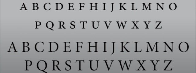
Fig. 1.48 - Small capitals - Uppercase numerals: These numerals are the same height as uppercase letters and are all set to the same kerning width.
- Lowercase numerals: These numerals are set to x-height with ascenders and descenders.
- .Italic: Most fonts today are produced with a matching italic. Small caps, however, are almost always only roman. The forms in an italic refer back to fifteenth century italian cursive handwriting. Oblique are typically based on the roman form of the type face.
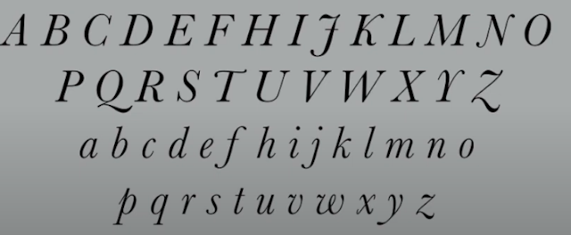
Fig. 1.51 - Italic - Punctuation, miscellaneous characters: although all fonts contain standard punctuation marks, miscellaneous characters can change from typeface to typeface.
- Ornaments: Used as flourishes in invitations or certificate. They usually are provided as a font in a larger typeface family.
- Roman: The uppercase forms are derived from inscriptions of roman monuments. A slightly lighter stroke in roman is called a book.
- Italic: Named for the Fifteenth century italian handwriting on which the forms are based. Oblique conversly are based on roman for of typeface.
- Boldface: Characterised by its thicker stroke than the roman form.
- Light: A lighter stroke than the roman form. Even lighter strokes are called thin.
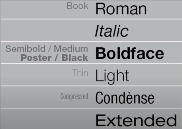
Fig. 1.52 typefaces
The uppercase letterforms may appear symmetrical but a close examination shows that the width of the left slope is thinner than the right stroke.
Maintaining x-height
Counterform is extremely important because it aids in the readability of formatted text or letterform. When letters are joined to form words, the counterform includes the spaces between them.
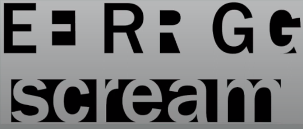 |
| Fig. 1.55 - Counterforms |
You can understand counterform by examining other forms in great detail. The examination provide a good feel for how the balance between the form and counter is achieved and a palpable sense of letterform's unique characteristics.
sketches:
 |
| Fig. 2 - Sketches for soup |
For the first word soup, I decided to play with the idea of a shape of a bowl. First i tried two seperate sketches making the full word form the shape of a bowl. Then i decided to make the 'U' the bowl. On one of sketches i use the an 'S' to convey steam coming out of the bowl.
 |
| Fig. 2.1 - Sketches for spooky |
For the word spooky, I first started with flippng the 'o' and adding a smaller 'o' in the middle to give the effect of eyes. The effect really works well the font 'Bembo Std Bold' due to the elongated letter 'o'. The next sketch is trying to give the effect of somone being eerily lit by a streetlight. For the third sketch i duplicated the word, lowered the opacity and arranged it in a way that makes it look ghostly. For the last sketch i increased the kerning on the letters to make them feel more isolated.
 |
| Fig. 2.2 - Sketches for fold (10.10.2023) |
 |
| Fig. 2.3 - Sketches for impact (10.10.2023) |
For the word impact, I first used a bold font that has a 3D effect. For the second sketch the word is hitting a another pair of words and causing an exploding effect showing the level of impact. For the last sketch I was trying to mimic the look of a shockwave or bomb going off from a top-down perspective.
 |
| Fig. 2.4 - Process for fold |
For fold i used a clipping mask and duplicated the text. Then I pasted it directly over the other text and used a clipping mask in order to cover half the word as suggested by Vinod sir. I also added a thin line to emphasise the fold.
 |
| Fig. 2.5 - Process for spooky |
 |
| Fig. 2.6 - Process for soup |
 |
| Fig. 2.7 - Process for impact |
 |
| Fig. 2.9 - Type expression animation |
TASK 1 EXERCISE 2 - Type formatting
For this task I first created sketches using a simple geometric layout for the format. The title is colored black, the content is grey and the pictures are light grey.
 |
| Fig. 2.10 - Type formatting sketch 1 |
 |
| Fig. 2.11 - Type formatting sketch 2 |
For the final Format i went with the second sketch. This is because it looks like the 'H' from Helvetica.
 |
| Fig. 2.12 - Type formatting process |
Font/s: ITC New Baskerville Std
Type Size/s: 55
Leading: 60
Font/s: Bembo Std
Type Size/s: 10
Leading: 12
Paragraph spacing: 3mm
Characters per-line: 55-65
Alignment: Left justified
Columns: 2
Gutter: 5 mm
Experience: The class itself is very informative and intresting.
 |
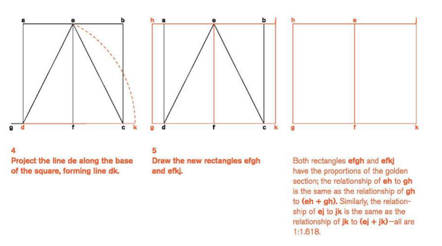
I also learnt about the Golden section. This is a huge influence of the sense of proportion found in western art. The term itself describes how a relationship occurs between two numbers when the ratio of the smaller to the larger is the same as the ratio of the larger to the sum of the two.



Comments
Post a Comment